 |
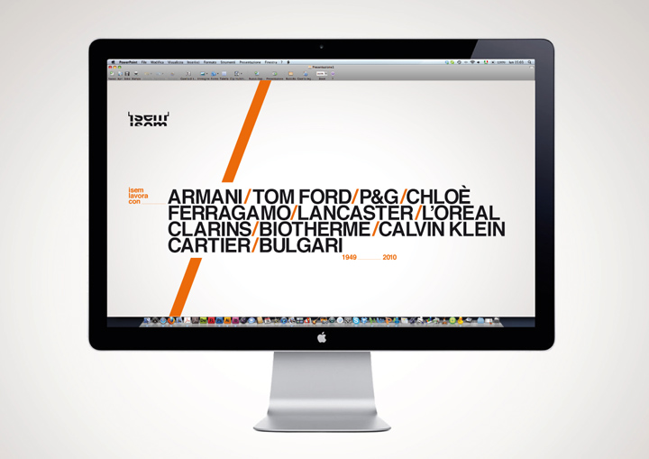
| ISEM is the Italian market leader for luxury packaging in cosmetics and perfumery. Established in 1949, in 2011 the company started a new chapter in its history, re-positioning itself in national and foreign markets with new goals and a new corporate image. |
 |
| Designed by Mattia Castiglioni, the corporate image needed to express ISEM’s identity: it’s conceptually creative, structured, organized shapes and layout, characterized by a strong, memorable and highly distinctive sign, as well as being able to introduce a message of innovation. Colour becomes a mark. The orange highlights a solid and organized business structure, by interacting with an equally sophisticated typography. |
 |
| Nice basic type layout for the business card. |
 |
 |
| Very careful alignment of the print and online corporate identity, above and below. |


